Image you are an analyst for the British navy in 1915 and you are asked to study ways to save British ships from German U-boats. Unlike in 1915 you have access to modern computer graphics but must still make due with the data available at the time. What can you do?
The data are the number of boats sunk and tonnage lost every week. Your predecessor provided data to the Guardian news organization and the following information has appeared in the newspaper.
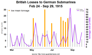
The following graph eliminates many of the distractions in the Guardian news article. You first create a cleaner picture of the data by removing the chart junk that make the data difficult to see. These include heavy grid lines and boundaries around the plot. You also separate the data for ships and tonnage by scale, chart type and color.
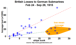
Next, the scatter plot below highlights seven weeks which showed lower than average tonnage lost per ship. In most weeks there was an average loss of 2631 tons per ship sunk. In the seven highlighted weeks, the losses were 683 tons per ship. So tonnage losses were moderate despite the loss of a large number of ships.
The points from the region of interest have also been highlighted in orange as described in my post on the pulley problem.
The seven points are then also displayed in orange on the bar/line chart, thereby pointing out the weeks that are different. Once those weeks are noted, the Admiralty can begin to determine whether there were any differences in escort vessels, size of convoys, weather conditions, etc. that would have lead to the different results and whether these results were favorable or unfavorable.
Aesthetically pleasing graphics are just one element of the process of data visualization. In summary, the ability to tell a story of interest is the key contribution from graphics.


